Our logo
Accion’s preferred logo is orange on a white background.
High-resolution logos can be downloaded here. Users must be logged in to Accion’s SharePoint to view.
Basic visual identity
The Accion mark sits at the center of our visual brand and is our principal identifier.
Our mark is bold and assertive, yet warm and approachable. It is a representation of who we are. It speaks to our honesty, humanity, and confidence. The Arrow shape “A” represents our spirit of innovation and focus on creating a fair and inclusive economy for the nearly 2 billion people who are failed by the global financial system.
Name in text
In English copy, “Accion” should be written in title case. We no longer associate Accion with an acronym, so Accion should never be written in all capital letters (“ACCION”) in any language. It is also always a standalone word, not used with qualifiers such as Accion International. Legal documents may be an exception as they will follow the correct name for Accion’s legal structure in your area, as set out and approved by the Legal Team. In all public usage, we are:
Accion (Eng)
Acción (Spanish)
Note: In Spanish copy, we add an accent mark over the “o” to avoid the impression that we have made a mistake being that the word “acción” has meaning in Spanish.

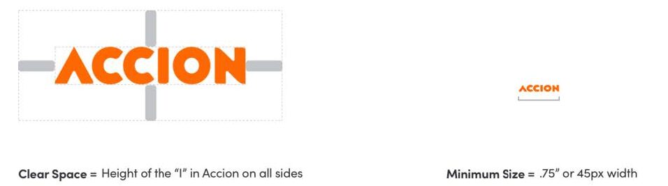
Clear space and minimum size
The mark must be surrounded by a generous field of clear space in every application to create isolation from competing elements. The mark must also adhere to the minimum size requirements to ensure impact and legibility.
Logo variations
The primary logo color treatment is our signature orange on white. However, the logo can appear in colors from our brand colors, contextual colors, black, or white. Carefully consider before using these variations. We do not use gradients on Accion logos. Backgrounds for the logo are more variable, though Accion’s color palettes, gradients, or black or white are always preferred, and the logo must maintain visual accessibility.
Draft visuals with photo backgrounds must be sent to the Communications Team for approval before any public use.
Sub-brand logo usage
Some sub-brands, including the Center for Financial Inclusion and Accion Ventures, have their own logos or logo lockups. No new logos or logo lockups should be created for any sub-brand or project without approval from Accion’s Chief Communications Officer.
Not all sub-brands will have their own logo. Each sub-brand logo or logo lockup has unique guidelines on whether to use the sub-brand logo or the Accion logo. Contact the Communications Team if you are unsure which logo to use.
The logos of these sub-brands follow the same spacing and primary color guidelines as Accion unless otherwise stated.
For guidelines on using the Center for Financial Inclusion (CFI) logo, please use the Center for Financial Inclusion (CFI) brand guidelines.
Partner logos
Any use of partner logos must be approved by the respective partner. The organization will likely have their own brand guidelines, which will also need to be followed. If these external logos are used alongside the Accion logo for co-branding purposes, the Communications Team must approve this usage.
Logo misuse
A common look and feel to all our materials improve cut through with key audiences, strengthening the Accion brand. Any misuse of the mark, no matter how small, compromises the credibility of our brand.
The examples shown demonstrate a few of the many possible non-compliant logo reproductions.