Data Visualization

Data Visualization

Charts

Charts should be clean, clear, and include each of the elements labeled when possible.  Typically the simplest chart type is the most effective.
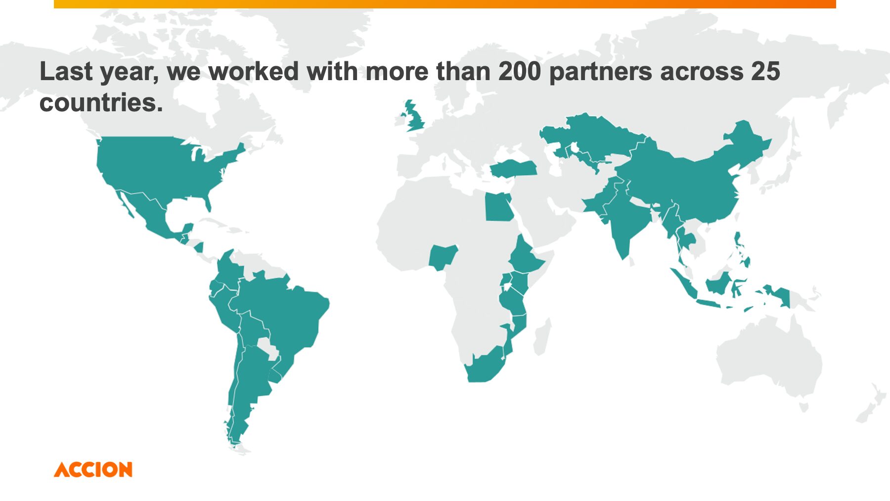
Maps

Maps should be minimal and clear.  Use reduced graphics maps, instead of satellite or 3d maps when visualizing trends or other high-level information.

Color Logic

When creating successful data visualizations, choosing the right color logic is paramount. A sequential scheme is best suited for data that progresses from low to high, A qualitative scheme is best suited to represent nominal or categorical data. Follow this chart and review this resource before creating data visualizations.

Color Palette

When visualizing data, it is essential to have an extended color palette beyond the core brand colors. Color combinations are dependent on the number of data classes within your chart or graph, so use this guide when creating data visualization.  

Do’s & Don'ts

Data visualizations should adhere to our brand’s color balance and color logic in all applications.

If you need more than seven colors in a chart, consider using another chart type or group categories together. Colors make it easy to let readers distinguish between categories in your data, but try to avoid using more than seven of them. The more colors in a chart represent your data, the harder it becomes to read it quickly. Your readers will need to often consult the color key to understand what is shown in your chart. Try using a core color in combination with our grey palette to create a focal point within the chart.